
Yeezys for everyone
I think it is already safe to say it has been a career year for Kanye West and his Yeezy brand with 2019 being his most active in terms of drops. In 2017, Kanye West promised “Yeezys for everyone”. Two years on and his vision is really beginning to come to fruition. What this has meant for the consumer is that we are seeing more and more additions to the Yeezy catalogue. The majority of this being focused on the brand’s three most popular silhouettes; the Yeezy 350, 500 and 700. What this has meant is that the creative efforts have been channelled more into colour than shape. Meaning we have been braced with a wide variety of Yeezy colourways of late.
You might think that this is a good thing, choice is always a nice thing to have, right? Well it has been suggested of late that perhaps the Yeezy colourways in some instances are increasingly similar. Recently, during an interview with Forbes, we got an insight into the in-depth creative process that comes prior to every release from the Yeezy brand. With Kanye West showcasing a huge collection of prototypes that didn’t quite make it to the shelves, or are yet to make it to the shelves.
The most striking thing from observing them visually, were the sheer variety of colours that are clearly tested before arriving on an end product. The collection looked like a colour wheel of pastel and earthy tones, typical of West’s distinctive design language. So, it got me thinking, and I began to pose the question: Why is it with such variety in the design stage, do we end up on release day with shoes that are so increasingly similar?

Do some Yeezy colourways look too similar?
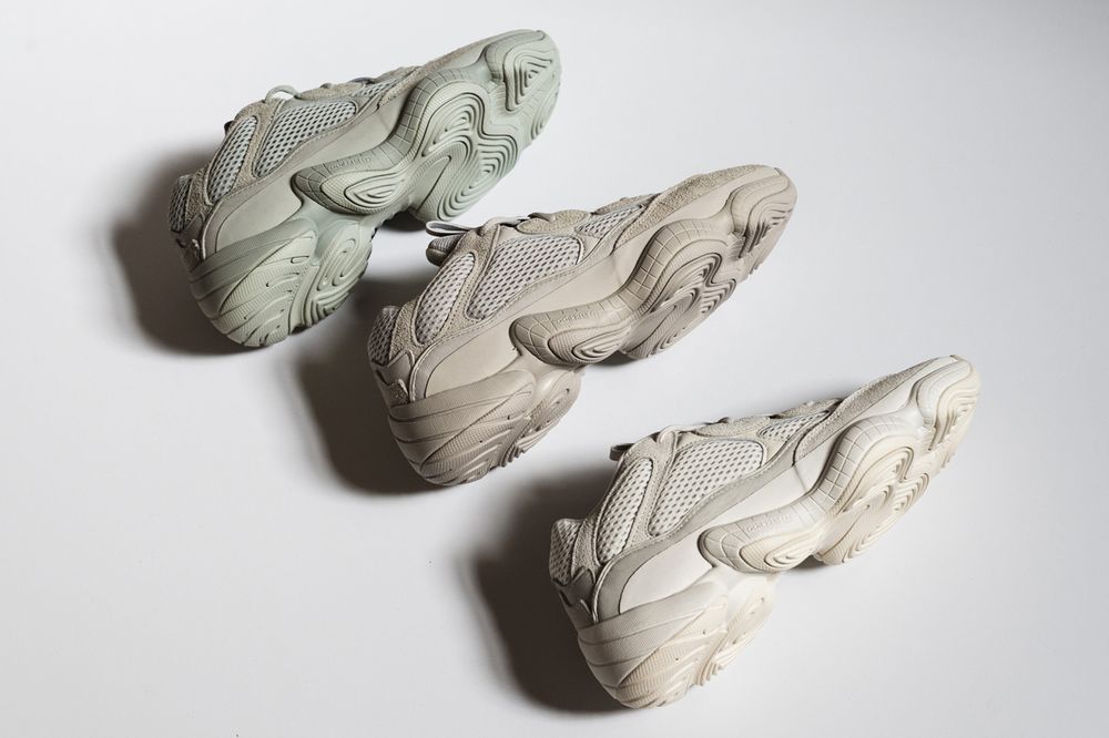
When I talk about Yeezy colourways looking the same, of course it is a bit of a generalisation, but hear me out. I have some pretty glaring examples of exactly what I am talking about. The Yeezy Boost 500, until 2019, had kept it simple, releasing an initial trio of colourways; Utility Black, Blush and Super Moon Yellow, which aesthetically translated as a black, light taupe tinge, and pastel yellow/sand colour respectively. All clearly identifiable from one another.
Things began to get a little more hazy, however, when the Yeezy 500 Salt dropped early in 2019. Arriving in a light grey tone with a sort of faint almost green accent, the similarities between the Blush and Salt were sort of apparent. Yet they were different enough to justify both being on the market. Alarm bells really began to ring when the latest addition to the Yeezy 500 product line, the Yeezy 500 Bone White was released. Aesthetically describes as an “Off-White” tone the colourway completes a trio of essentially grey-ish Yeezy 500 models.
This is clearly by design. As I don’t think you could describe Kanye West as lazy in his process, in fact, he’s quite the opposite. So it really does bode the question, why make them so similar? And not to mention with other colourways on the horizon with names like ‘Soft Vision’ and more worryingly ‘Stone’. It really does make you wonder whether this is going to continue.
Other examples of similar looking Yeezy colourways
Obviously, in some cases its clear that the Yeezy colourways are deliberately similar. In the case of some designs like the Inertia – which originally arrived on the Yeezy 700 silhouette – has been rumoured to be dropping on the updated v2 silhouette. Naturally these will be incredibly similar, but as they are presented on different models the differences are clear to see. In the case of some of the older Yeezy 350’s however, they fall foul of the same issues the trio of Yeezy 500s do. The Moonrock, Oxford Tan, and Sesame colourways for the Yeezy Boost 350 share a similarly executed trio of earth palettes, with only slight differences between the them.

I think what it boils down to with all of Kanye West design choices aesthetically is the sense of detail. I’m sure Kanye West will look at each of his designs and tell you exactly how different they are. The devil is, after all, in the details. Each model may on the face of it look similar, but it is important to note, never the same. His signature earth tones and pastel highlights only exaggerate his portfolio’s strength as a whole. Something that should be marvelled not criticised.
Keep up to date with all Yeezy online trainers news right here with Laced.