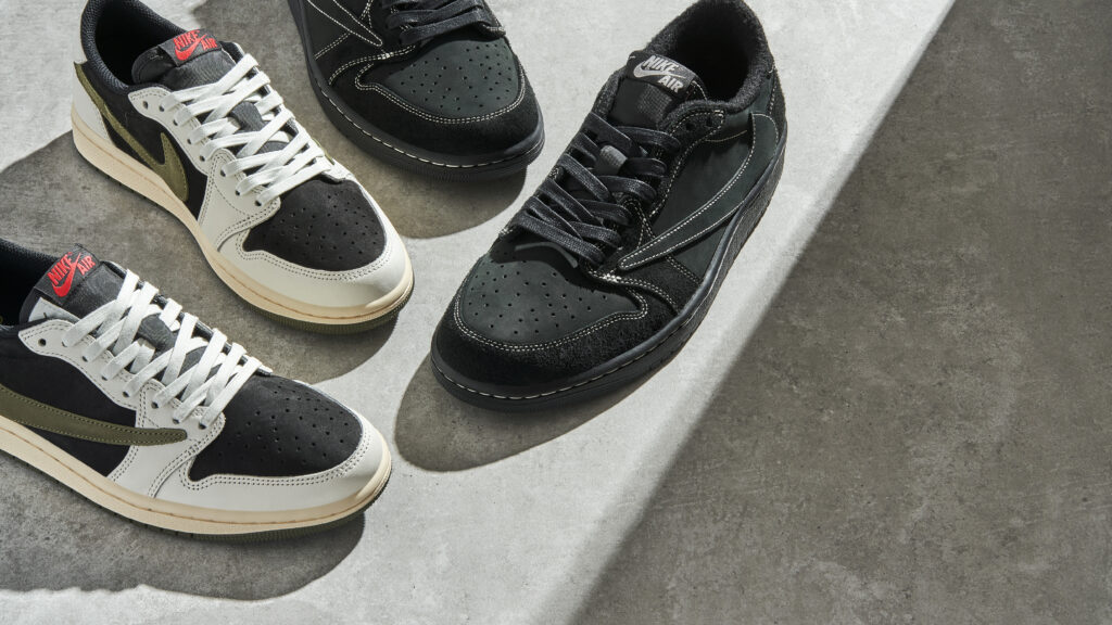
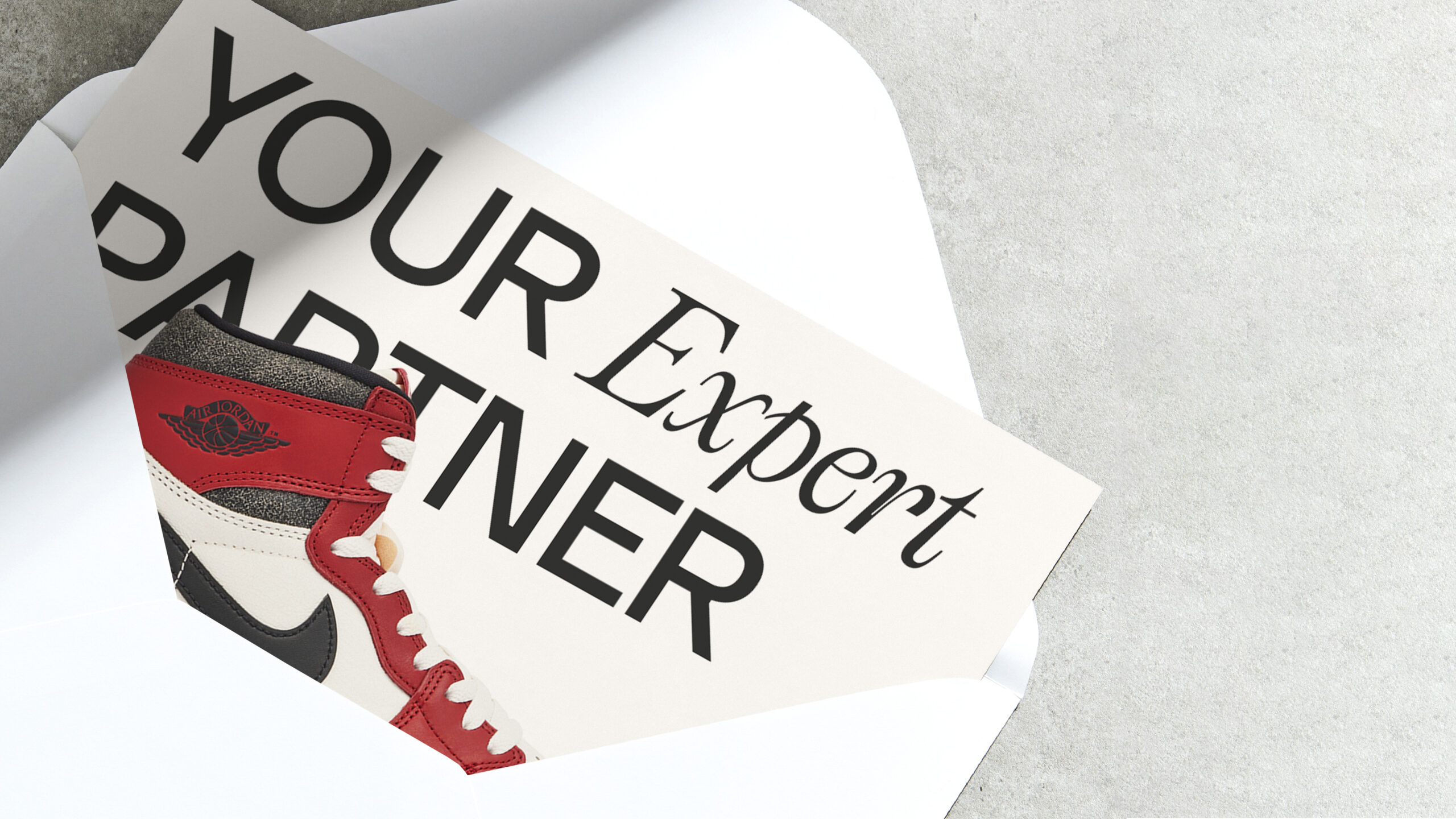
Since launching in 2018 as a UK-based platform for buying and selling coveted sneakers, Laced has evolved into an industry-leading luxury goods marketplace. Now, as we enter a key stage of our growth, we’re launching a brand-new look that will propel us into the next phase of our expansion. Offering the same reliable service, rigorous authentication process and easy-to-use platform we’re known for, we’re proud to deliver our users a refreshed, modernised version of Laced.
A New Signature
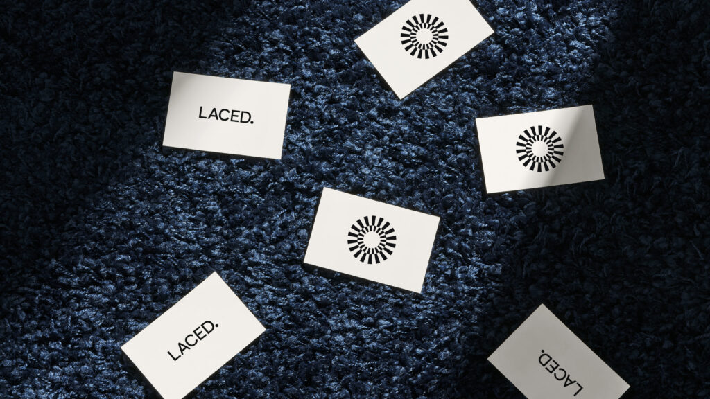
The new Laced logo represents everything we stand for as an organisation. Designed using our all-new bespoke typeface, it’s refined, assured and timeless. Ready to replace our famous four-lined ‘L’ logo, our new identity encapsulates our dedication to maturing with our users and delivering a premium, user-centric platform. Perfect kerning and balanced letter forms work together to deliver simple yet contemporary excellence, and the logotype is finished with a confident full stop to allow a visually balanced brand mark.
Authentication First
Inspired by NASA’s spacecraft parachute, the new Laced brand property represents the safe delivery of precious cargo to its final destination. Synonymous with our dedication to safely delivering authentic luxury items to our buyers, the unique radial design comes complete with segments that epitomise our progress and unique step-by-step approach to authenticating products.
The segments are pieced together to form a closed ring to symbolise our dedication to security and trust. Forming a key part of our new visual identity, the radial design will feature on our updated authentication tags, as well as some digital designs.
Premium Neutrality
The new Laced colour palette is designed to elevate the brand to premium status. Yeezy White, Superstar Platinum and Air Jordan Black leave space for product imagery to be the centre of attention and, when combined with our bespoke typeface, delivers an aesthetic that is distinctly Laced.
Functional & Expressive
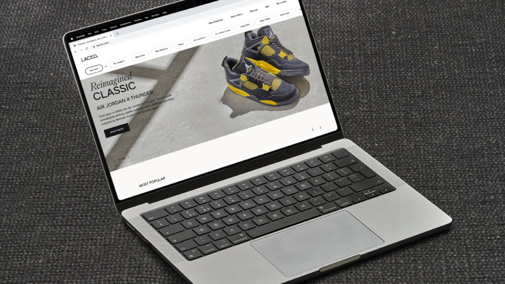
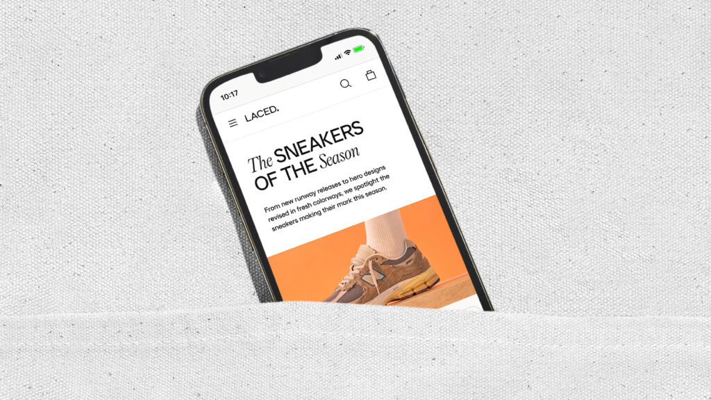
Exclusively designed by colophon, our new typographic system is made up of two custom-made typefaces: Laced Sans and Laced Serif. Both distinct and impactful, each is used to complement different elements of the user’s journey.
Laced Sans is functional, open and simple, while Laced Serif is more expressive and reserved to creatively highlight headline moments for the brand. Importantly, both Laced Sans and Serif are legible in both upper and lowercase, allowing the user to fully immerse themself into our content without obstacle. Ink traps in the Laced Sans ensures a clean overall aesthetic, while subtle stylising on the Serif font adds a flair of luxury.
Moments That Tell A Story
The new Laced identity is expressed through photography that puts real life at its centre. We aren’t influenced by trends, we focus on authenticity and we see things through an optimistic lens. Product remains at the forefront of our photography and retains focus, while our art direction complements and enhances the subject of the image.
Our rebranded photography angle is further enhanced by a refined tone of voice. With accessibility and simplicity at the forefront, the Laced tone delivers a calm confidence through the use of welcoming, easy-to-understand language that shapes our storytelling.
